Thursday, 13 March 2014

Focus Group 13/03/2014

After the success of my previous focus group, I decided to undertake another one after having completed the first draft of my final campaign. I asked the same people as my previous focus group, again in order to gain the opinion of my target audience.

Me: What is striking about the teaser poster?

Chloe: Definitely the hand coming out of the eye. That is so creepy! It looks really good, it blends together as one image aswell which is always a bonus. 

John: I agree with Chloe I think you should keep that element. But the cross also strikes me. Maybe you could put it in a different place though, it doesn't seem very noticeable? I can tell the basis of your narrative through the poster, though. 

Kelly: I like the hand coming out of the eye, too. Such an original idea. 

Sam: The eye, aswell. 

Me: What could be improved about the poster?

Kelly: Keep the hand coming out of the eye element. But maybe make the eye a bit more scarier? I know [the model] has blue eyes, so it's definitely been edited. But it doesn't seem related to horror, much. If you're talking about demon child possession, maybe a red? You could make the pupil stand out more, too. It kind of just blends in.

Sam: I agree, just the colours. The poster as a whole is excellent, it gives away just enough storyline without giving away too much. But it seems as though you haven't really decided on a colour scheme, it's murky and dull. I still think white should be a big element of your poster though, as it links to the supernatural. Maybe make the whites of the eye brighter, and the title white?

John: Yeah just the colours. And other than that, the sharpness of the images aswell. The hand kind of blends in with the eye and isn't really noticeable. And the eyelashes themselves are blurry.

Chloe: I really like it. But if I could choose one thing to improve on other than colour, it would be the surrounding. Maybe make the eye 'pop out' of something rather than fully blend in with the background? A black, or an extremely clear white. 

Me: What elements do you like about the official poster?

Sam: I really like the church and cross in the background. It is the first thing that catches my eye, and it tells me a little bit about the narrative. I know I said previously put this in your title, so please don't get rid of the cross idea all together. Compared to [my mock-ups], it helps give clues as to the narrative.

Chloe: I love the way you've put a kind of glow around [the model]. She looks much better in white than red, it shows that the sub-genre is supernatural rather than gore. The glow gives her an eerie feel, it gives me shivers! It almost looks as though she's walking towards the camera. Creepy!

John: I really like how your background has been tainted. You've not only blended the image of the church, but added splats and cracks that look like the poster is 'falling apart'. It's a really good effect, and it still doesn't look over edited. 

Kelly: I like the church in the background the most. Maybe centre it and re-arrange the poster, though.

Me: Do you have any comments that could help me improve?

Kelly: I could see your tagline clearly in your teaser, and here it almost gets lost. It's not centred, either. I think you should definitely stick with the idea of your tagline sticking out at the top. 

Sam: I like how you've edited [the model], but I just don't think the hair COMPLETELY over the eyes works. You can't really tell whether she's facing forwards or backwards. But don't get rid of the idea all together. Maybe just show an eye or something to show it's the front. The long hair makes it all the more creepier. 

John: It feels like you've got a lot of fonts going on. I think you should pick one or two fonts and stick to them in order to remain consistent. I love how you've done your own credit block, though. Definitely keep that font, it looks professional. 

Chloe: I think it's just the main image and the title could have more definition in colour. Other than that, I like the poster.

Me: What are the positive elements of my DVD cover?

John: This is really, really good. It looks super professional. I think for your campaign, you should definitely stick with the black colour scheme rather than murky greys. I love the consistency of font, colour etc in the DVD cover. The layout is almost an exact replica of a professional case!

Kelly: This is definitely the best out of all three drafts. I love the image of the model. See, it's a lot more creepy when you can see her eyes. Perhaps make them even more creepy, if possible! 

Sam: I really like the blurb. The way you've included typical elements of the genre like 'Satan' and even your own title 'The Ritual' really helps give clues towards the narrative. All the comments splattered around the case in a professional way help add to the effect.

Chloe: I love how the cross and church is included, again. Make it more visible perhaps? Overall, this is amazing. You've even paid particular attention to the spine of the cover which is often neglected, even by the professionals! And it's important because it's the first thing you see when flicking through shelves for a new DVD.

Me: What could be improved about the DVD cover?

Kelly: There really isn't much I can see at all. The only thing I can see is the overlap of writing at time. It may just be the way it's printed out, but just make sure everything is neat and clear of overlap.

Sam: There's not much I can see, either! Perhaps edit the pictures on the back more, and make them correlate with one another. That's about it. 

John: I think maybe just having one toy on [the model]'s lap would be more effective. I think the teddy bear has more connotations with childhood. The baby's good aswell though. It's up to you, but I think you should just choose one, and centre it on her lap. 

Chloe: I can't think of anything else other than what's already been said. I really like this.

Me: Thankyou for your comments, both negative and positive. I will take all of this in to consideration in order to alter my campaign ready for the final product. 

Tuesday, 11 February 2014

Tuesday, 21 January 2014

Brief narrative outline


A young Christian girl and her family go to a Sunday Service. Whilst praying in front of the votive candles, suddenly the lights in the church go off, strong winds blow out the votive candles and smash the stain glass windows. We then see a close up of the crucifix on the altar as the glass has fallen and red wine pours onto the crucifix which connotes religion lost. Whilst the lights were off, the young girl of the family passes out and becomes possessed - this the audience does not know at this point. The family then returns home and looks back on their experience at the church, meanwhile the girl is being silent and behaving strangely, she gives almost a personified stare, and doesn't talk much. Over the remaining days, the girl begins to partake in odd behaviour such as talking to thin air, behaving strangely towards her siblings and distancing herself from human contact. At one point, she even runs away to the church. It is in the middle of the film that it is revealed the child is possessed when the family decide to get help in from a psychiatrist first, followed by a priest when that fails. The rest of the film is spent trying to perform a ritual on the child which in the end results with the death of her.

Tuesday, 17 December 2013

Sunday, 15 December 2013

Mock Up #2


As I stuck with the same idea for the campaign through both posters, my second mock up is a  teaser poster. I much prefer this poster to the official poster, as I feel it connotes the idea of the film a lot more. The slogan seems much more obvious than the previous one, as it connotes the idea that something is hiding within the child's body. I also like the way I've still used the colour scheme of black, reds and whites though in a much more subtle, less vibrant way than previous which I think makes the poster look more realistic. I think the way I've changed the opacity of the layer with the child's face in agony is very effective, as it contrasts and so emphasizes completely the hand. The poster also looks a lot more bleak and washed out, which I think looks better for my idea. I like the way I've used scratches and blotches on a low opacity sporadically in order to make the poster less structured. Finally, I much prefer the font type used for the title (Modern No. 20)

To improve on this poster, though I like the image of the hand, I would perhaps change the image to something more suitable of the genre as I feel it may not fit the background image appropriately in relation to the possession sub-genre. I would make the image of the hand or its replacement more clear and perhaps try to connote the idea of pain through the main image as well as the child's face, perhaps by adding blood brushes and cracks/smudges/dirt to make the child look more deformed and less life-like. I would also darken the image by lowering the brightness and raising the contrast, however I like the way that in this poster I used the burn tool between the fingers to do so. To improve I would also edit the child face slightly, perhaps show that something is within her body through having something coming out of her mouth and make her skin look more deformed.

Mock Up #1


This is the result of my first mock up. This particular poster would be the official poster for the campaign, as it contains elements such as the credit block, the exact release date, the actors in the movie and so on and so forth. I like the way I've used cracks and blood splats in the background to make it look as though the poster is crumbling, and through doing this I've intertwined the black, red and white colour scheme within the poster, using a mixture of black and blood red cracks cobwebbing the typography, which also fit the colour of the dress. I think the way I've made the main focus of the poster (the girl and the dress) look more emphasized than real through the use of glamour glow is effective. The slogan used for this poster seems very topic appropriate seeing as 'God' is linked with the lexical field of religion.

To improve in my final piece, I will make sure to take photos of suitable backgrounds connoting the title instead of using plain black in order to give the poster a more life-like effect - perhaps a church or a set-up exorcism scene. I also dislike the way I've intertwined typography together as in some cases it does not suit the genre, and I would  need to stick to one form of typography rather than three. Perhaps I could also think of ways to merge the background, image and text together to make it look as one rather than a put-together text.

Sunday, 24 November 2013

More playing around with typography...

I created the original typography on Microsoft Word using 'Times New Roman' in order to conform to typical 'possession' typography. I again used small caps to conform, and added a white glow around the edges.


After editing. I used pixlr.com to edit very subtly. I adjusted the Gaussian blur on the word 'Ritual' and added smudge brushes over the 'R' to give a supernatural effect. I also decided to add scratch marks in the corner to create enigma codes. 
This is the first typography in which I have used no red, and I don't like it as I feel it is missing a demonic presence - however I like the overall design. To improve, I would change the scratch to perhaps a red to include more of the demonic colour scheme.


In this design, I used the font 'You Murderer' which I downloaded from dafont.com a while ago. I decided to change the font to a deep red in order to use the typical demonic colour scheme however still used a white glow to keep the theme of the supernatural.


Through editing on pixlr.com, I decided to make this font more messy and abstract than the rest to create a sense of panic and disaster. I randomly scattered scratch, dirt and blood brushes over the piece to create a sense of chaos, and decided to stick with the red scheme. If I were to make changes, I would attempt to strategically place the red brushes whilst still being abstract.


Again, I used Microsoft Word to create the original font. I used the font 'Georgia' and chose a deep red, including Microsoft's cross symbol rather than a 't' in order to promote the genre. I added a slight white glow around the edges of the text.

 When editing on pixlr, I decided to keep the idea as basic as possible. The only editing I chose to do was put emphasis on the cross, emphasizing the genre. I added a white overlay around the edges of the cross and used a soft circle brush in the middle of the cross, and lowered the opacity. This is one of my favourite ideas.

Tuesday, 19 November 2013

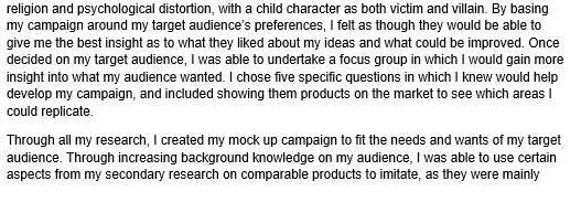
I researched further into audiences for the horror genre and audiences for films comparable to my idea...


Monday, 11 November 2013

Typography preperation

I have reached the stage where I have begun thinking about possible titles for my horror campaign. I took into account the results from my questionnaire and responses from my focus group, and decided to base the campaign around the 'Possession' sub-genre. After gaining others opinions, I have come up with five possible titles to use for my work. These are:

The Exile
Demon
Ritual
Possessed
Contained

My personal favourites are 'The Exile', 'Demon' and 'Ritual'. Therefore, I have decided to play around with these fonts in most detail.