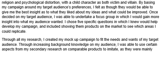
After the success of my previous focus group, I decided to undertake another one after having completed the first draft of my final campaign. I asked the same people as my previous focus group, again in order to gain the opinion of my target audience.
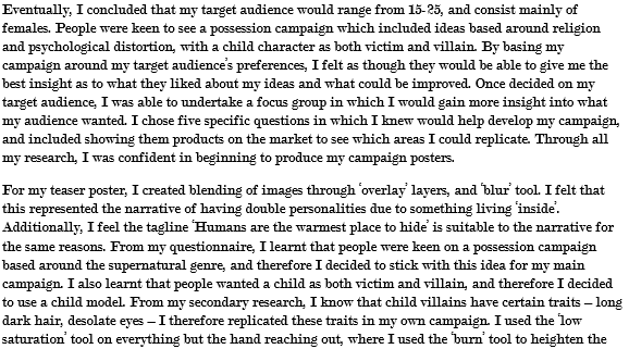
Me: What is striking about the teaser poster?
Chloe: Definitely the hand coming out of the eye. That is so creepy! It looks really good, it blends together as one image aswell which is always a bonus.
John: I agree with Chloe I think you should keep that element. But the cross also strikes me. Maybe you could put it in a different place though, it doesn't seem very noticeable? I can tell the basis of your narrative through the poster, though.
Kelly: I like the hand coming out of the eye, too. Such an original idea.
Sam: The eye, aswell.
Me: What could be improved about the poster?
Kelly: Keep the hand coming out of the eye element. But maybe make the eye a bit more scarier? I know [the model] has blue eyes, so it's definitely been edited. But it doesn't seem related to horror, much. If you're talking about demon child possession, maybe a red? You could make the pupil stand out more, too. It kind of just blends in.
Sam: I agree, just the colours. The poster as a whole is excellent, it gives away just enough storyline without giving away too much. But it seems as though you haven't really decided on a colour scheme, it's murky and dull. I still think white should be a big element of your poster though, as it links to the supernatural. Maybe make the whites of the eye brighter, and the title white?
John: Yeah just the colours. And other than that, the sharpness of the images aswell. The hand kind of blends in with the eye and isn't really noticeable. And the eyelashes themselves are blurry.
Chloe: I really like it. But if I could choose one thing to improve on other than colour, it would be the surrounding. Maybe make the eye 'pop out' of something rather than fully blend in with the background? A black, or an extremely clear white.
Me: What elements do you like about the official poster?
Sam: I really like the church and cross in the background. It is the first thing that catches my eye, and it tells me a little bit about the narrative. I know I said previously put this in your title, so please don't get rid of the cross idea all together. Compared to [my mock-ups], it helps give clues as to the narrative.
Chloe: I love the way you've put a kind of glow around [the model]. She looks much better in white than red, it shows that the sub-genre is supernatural rather than gore. The glow gives her an eerie feel, it gives me shivers! It almost looks as though she's walking towards the camera. Creepy!
John: I really like how your background has been tainted. You've not only blended the image of the church, but added splats and cracks that look like the poster is 'falling apart'. It's a really good effect, and it still doesn't look over edited.
Kelly: I like the church in the background the most. Maybe centre it and re-arrange the poster, though.
Me: Do you have any comments that could help me improve?
Kelly: I could see your tagline clearly in your teaser, and here it almost gets lost. It's not centred, either. I think you should definitely stick with the idea of your tagline sticking out at the top.
Sam: I like how you've edited [the model], but I just don't think the hair COMPLETELY over the eyes works. You can't really tell whether she's facing forwards or backwards. But don't get rid of the idea all together. Maybe just show an eye or something to show it's the front. The long hair makes it all the more creepier.
John: It feels like you've got a lot of fonts going on. I think you should pick one or two fonts and stick to them in order to remain consistent. I love how you've done your own credit block, though. Definitely keep that font, it looks professional.
Chloe: I think it's just the main image and the title could have more definition in colour. Other than that, I like the poster.
Me: What are the positive elements of my DVD cover?
John: This is really, really good. It looks super professional. I think for your campaign, you should definitely stick with the black colour scheme rather than murky greys. I love the consistency of font, colour etc in the DVD cover. The layout is almost an exact replica of a professional case!
Kelly: This is definitely the best out of all three drafts. I love the image of the model. See, it's a lot more creepy when you can see her eyes. Perhaps make them even more creepy, if possible!
Sam: I really like the blurb. The way you've included typical elements of the genre like 'Satan' and even your own title 'The Ritual' really helps give clues towards the narrative. All the comments splattered around the case in a professional way help add to the effect.
Chloe: I love how the cross and church is included, again. Make it more visible perhaps? Overall, this is amazing. You've even paid particular attention to the spine of the cover which is often neglected, even by the professionals! And it's important because it's the first thing you see when flicking through shelves for a new DVD.
Me: What could be improved about the DVD cover?
Kelly: There really isn't much I can see at all. The only thing I can see is the overlap of writing at time. It may just be the way it's printed out, but just make sure everything is neat and clear of overlap.
Sam: There's not much I can see, either! Perhaps edit the pictures on the back more, and make them correlate with one another. That's about it.
John: I think maybe just having one toy on [the model]'s lap would be more effective. I think the teddy bear has more connotations with childhood. The baby's good aswell though. It's up to you, but I think you should just choose one, and centre it on her lap.
Chloe: I can't think of anything else other than what's already been said. I really like this.
Me: Thankyou for your comments, both negative and positive. I will take all of this in to consideration in order to alter my campaign ready for the final product.